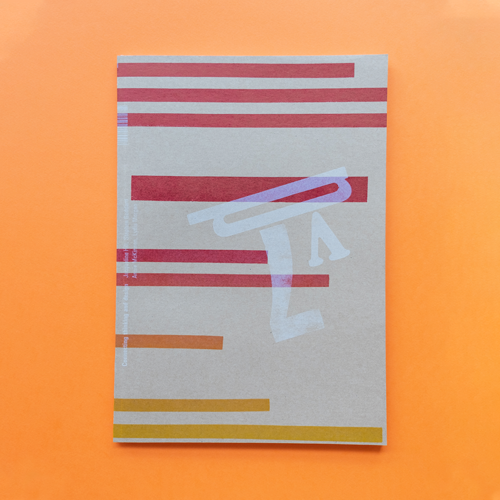
Ligature Journal Issue Eight, Out Now!

Last issue, we embarked on what we promised to be the first of three issues of Design and Place. Well, here we are with Ligature Journal Issue Eight, the second issue in the series. Once again we have the unusual, or perhaps we might say the ‘new’ usual, format of the previous issue. We received a few questions around the pages being joined along the top of that issue and whether this was a mistake. We say to you; nothing, but nothing is unintentional in the design and production. Notice the colour bars and trim marks—all part of the plan. We’re pushing out beyond the usual space that is the magazine page, quite literally.
The meta theme for this issue is Soul
It being a Soul issue means we are exploring psychological, philosophical and spiritual ideas around Design and Place. These ideas have thrown up some interesting questions. Does place really exist or is it just in our imagination? And what does this mean for designers? Are design and place actually connected? Can you separate place from self and design? What influence does place have on design and vice versa? How do designers define a ‘good place’?
Do we answer these questions? To some extent maybe, but the important thing is that we are asking you to think about the psychology, the philosophy and the spirituality of place in the context of design. If we trigger further questions for you and/or spark your own quest to find answers, then we have achieved what we set out to do.
The design team for this issue was drawn from the University of Technology, Sydney and, in another first for us, from UNSW Art & Design. From the fully letterpress printed cover to a fair portion of the illustrations we have had a lot of fun exploring manual image creation and mixed it in with the digital. And what a great visual landscape it is that has been created.
So take a journey through the terrain we present here and enjoy Ligature Journal Issue Eight.
The Cover
This issue has a fully letterpress cover. Printed in the Tiliqua Press studio using wood type, metal type and and elements cut from lino. To keep us on our toes we have included an ink blend and printed some elements with an opaque white ink (which was a challenge all on its own). We are, however, extremely please with the result and hope that you will be too.
We use on a hand operated proofing press to print with, a FAG Swiss Proof 40 built in the early 1970s we believe. On this machine the inking rollers are powered, however, they require frequent manual ‘topping up’. The net result—every cover varies slightly and therefore is unique.
Featuring the writing of:
Stephen Goddard, Jacqueline Hill, Dominic Hofstede, Lydia Morgan, Cat Burgess, Carlo Giannasca, Annie McKinnon, Tara Shelton, Simone Speet, Peita Blythe, Jess Leonard, Jeremy How, Camila de Gregorio, Natasha Ballantyne, Felix Oppen and Anne Vu.
Specifications:
88 pages
Cover: Buffalo Board from Ball and Doggett
Text: Grange Offset and Board from Ball and Doggett
4C process and letterpress
Print managed by SEED Print Group
About the Journal
Ligature Journal is a title owned by Tiliqua Press. The design and publication of the magazine provides real world experience opportunities for communication design students and recent graduates. For each issue interns find and/or create all the content. They design, lay out, create imagery (both illustration and photography) as needed and take the publication through production process.
If you haven’t already visited the Ligature Journal website you can see more spreads here.


