Sign Painting – A Great Fit
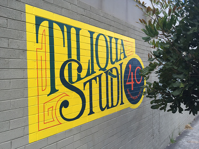
As you poke around our website you may notice that Tiliqua Press is based in St Peters, Sydney. What you may not know the actual home is at Tiliqua Studio – yes there is a pattern here isn’t there, a following post will explain the origin of the name.
After too many years of not having a sign on the building for Tiliqua Studio, we finally decided to do something about it. At first we considered some funky vinyl cut lettering but we just couldn’t get it to work. We had an identity that deliberately had no fixed typographic component – subject of a later post too – and we found what worked online just didn’t look right for the building signage. It was not the typeface per se, or the orientation of the words, it was that on an emotional level it didn’t feel right.
A while ago a colleague, actually a student of Felix’s, pointed us to a documentary Sign Painters. This proved to be the breakthrough we were looking for. So, we believe that print still has an important place in communication. We have been setting up a letterpress. We have a printmaking workshop (etchings, etc). In other words lots of traditional processes. A hand-painted, that is, sign painting for the studio identification felt like a really good fit for what the studio was about.
A Journey
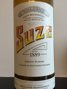
Inspired by the label of the French aperitif, SUZE …
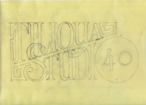
we began creating the artwork.
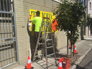
We looked around for a sign painter to do the work and on a referral from Astred at Design Cherry we commissioned Roger Warsop of Retroline Signs.
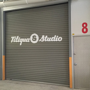
These images are of the street frontage of the studio. The premises is actually part of complex of units and we have access from an internal passage. Of course, though we didn’t have to, we decided to put a sign there too. This time we asked Roger to do the lettering, with great results.
We extremely happy with the way it turned, Roger has done a really great job, and though it has taken a while it is exactly what the studio, and Tiliqua Press, needed. A perfect compliment to our belief in the value of old and new technologies.


